
Introduction & Brainstorming
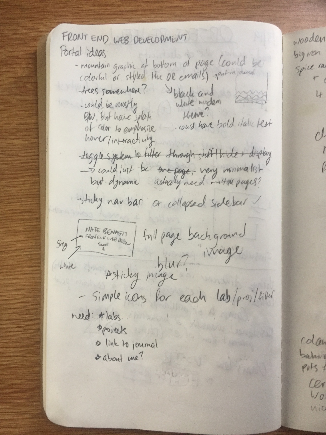
For my first project in my Front-End Web Development class, I am making a class portal that will serve as a storage capsule and launchpoint for all the labs and projects that I create in this class. The design is completely up to me, so I quickly got busy brainstorming different ideas for the theme and visual design, as you can see in these photos of my notebook below (don’t worry about trying to read anything here! I will go over all the key ideas in this blog post).

Concept/Theme
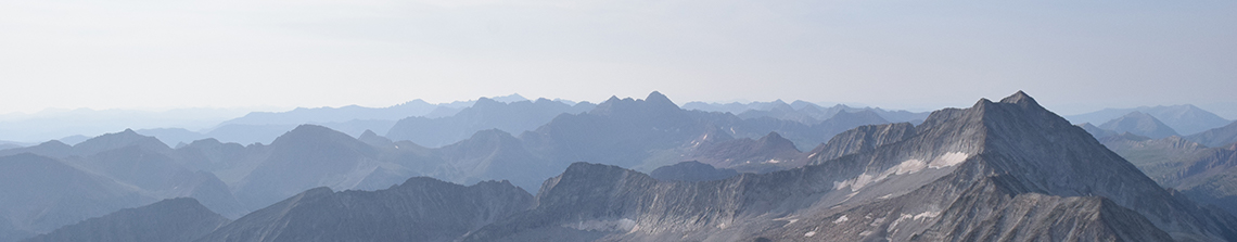
Since I love nature and the Colorado outdoors, I knew that I wanted to do something relating to mountains, forests, or both. I spend a good chunk of my free time outside, and volunteer on a mountain search and rescue team on the side, so the Colorado wilderness is definitely an important part of my life. As you’ll see in my drawings below, I decided to incorporate imagery of the mountains into my theme to make it inspired by nature.
However, I also want my portal to look very minimalist and sleek. To accomplish this, I plan on creating a black and white website, with text and icons that are comprised of black lines of consistent color and stroke size. To make it seem minimalist and modern, I plan on making heavy use of negative space, and giving all of my content plenty of room to breathe.
Visual Design
This brings me to the visual design of my class portal, and what I plan on making the website actually look like. Here’s an overview sketch of what the whole website will look like, from top to bottom:
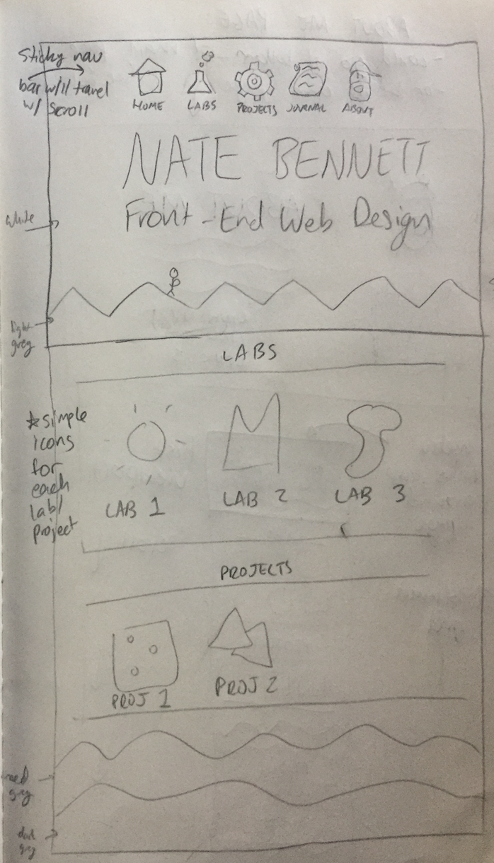
As you can see, the first page that users will see when visiting my site (the top-most rectangle of the sketch) will feature my name and the title of the class: Front-End Web Design (or Development). At the bottom of the screen, there will be a simple vector of mountains, perhaps with a small hiker somewhere on top of one. At the very top, there will be a menu with 5 icons: for the home page (the current view), my labs, my projects, my journal, and an “About Me” section.
Then, farther below the initial screen will be the actual sections for labs and projects, and the “About Me” section. The user can scroll down the page to access all of the content, as seen in the sketch below. As the user scrolls past each new layer of mountains (which separate the sections), the background will change to darker shades of grey to indicate that the user has scrolled farther down the page and is viewing different content.

For the “Labs” and “Projects” sections, there will be a 3-column grid (in desktop mode) of simple, line-based, black-and-white icons to represent each lab/project. I want these icons to be similar visually to the icons in the menu on the first page. For an idea of what I want these icons to look like, these helped to inspire me:


I want my grid of icons for labs and projects to be relatively airy, with plenty of room for each one and a lot of negative space. This was inspired by the following website screenshot, which employs a similar design. I like how clean and minimal this site’s layout feels, and it feels right in line with the theme I want to create. Of course, my icons will be a bit more unified, whereas the icons on this site each represent different portfolio items and are more differentiated from one another.

My idea for the layers of mountains is based on Outdoor Research’s website, which has a similar image of mountains at the bottom of their pages:

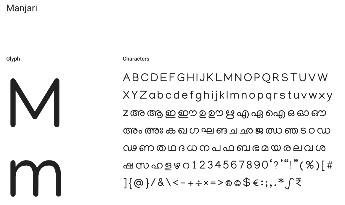
As for font, I want my font to have soft, rounded edges and be a nice light sans-serif, so that it will go nicely with my line-based B&W icons. I found a Google font called Manjari, which I really like:
Structure and Flow
I originally imagined this site as a dynamic one-page experience, where a user can simply scroll from the top of the page down past my labs and projects to arrive at the “About Me” section at the bottom of the page. Clicking on icons in the menu at the top would smoothly transition users to the desired section of the page, and the menu would be a sticky menu, traveling with the user as they scroll down the page.
However, I realized that one of the requirements for the portal is to have multiple pages all linked, so I might decide to break out the “About Me” section to its own page after double-checking with my instructor. If I end up going that route, the design will be slightly different, as seen in the photo below. The bottom of the sketch is Plan A, where I will have everything on a long, scrolling page, and the top of the sketch is Plan B, where the “About Me” page will be broken onto its own page.

Overall, I envision my class portal as being a streamlined and smooth experience, where a user can click on the menu icons and jump around the page, or just scroll around to find the content they are looking for. However, I may end up breaking things into separate pages if necessary.
Responsivity
In order to make my site responsive for all types of devices from desktop to mobile, I have a plan for how my site design will change based on different screen sizes.
On the first view with my name and website title, I will use different text sizes with media queries to shrink the page’s content down horizontally. The mountain border-graphic will be cut down slightly from the sides (instead of shrinking entirely, which could make it too small). However, on the labs/projects sections, I am going to shrink down the 3-column grid of icons to be a 2-column or 1-column grid, depending on how much screen size is available. Last, on the “About Me” section, I will collapse down the layout so that the image(s) and text (and any links) are vertically aligned instead of side-by-side horizontally.

 nate bennett