
After coming up with a detailed plan for my front-end web development portal in my Milestone 1 post, it is time to actually build my portal.
Process
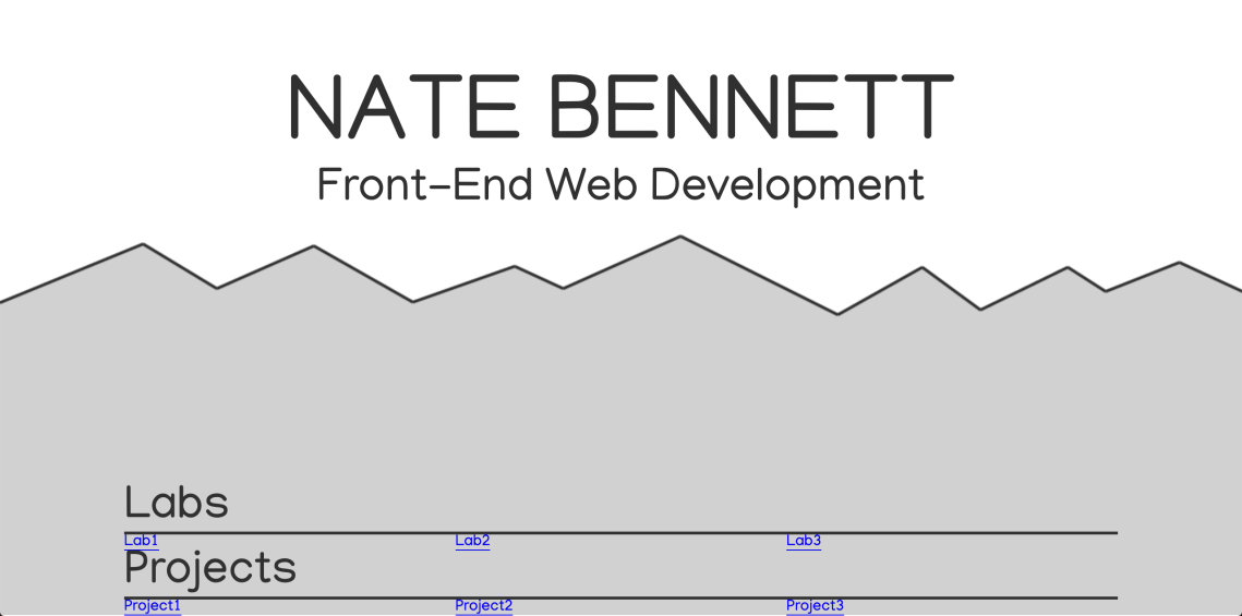
To start off, I wanted to just get the first page working so that it would cover the entire first view, no matter what device or screen size was being used. I remembered that you could use a width of 100vw (viewport width) and a height of 100vh (viewport height) for this, which worked great. I centered the title and subtitle on the first page, which I ended up liking, so next it was time to make a quick mountain graphic and fix it to the bottom of the screen using absolute positioning. At this point, I had a screen that looked like this:


At some point in the early stages of this project, I found myself wanting to use Sass features like mixins and variables, because I was writing a lot of the same code over and over again (especially for flexbox and simple centering of content). So, I made a quick detour to the Sass website to remember how to use it, converted my .css file to an .scss file, and kept working with the joy of reusable variables.
Next, I wanted to experiment with a parallax effect on the front page, where the clouds and titles would move at different speeds while the user scrolled. I actually ended up wasting a few hours trying to make this work, but for some reason was having a hard time getting even basic parallax examples working in Firefox (they worked in Chrome though), so I moved on. I feel like parallax can sometimes be more work than it’s worth, and it wasn’t a crucial part of my original design anyway.
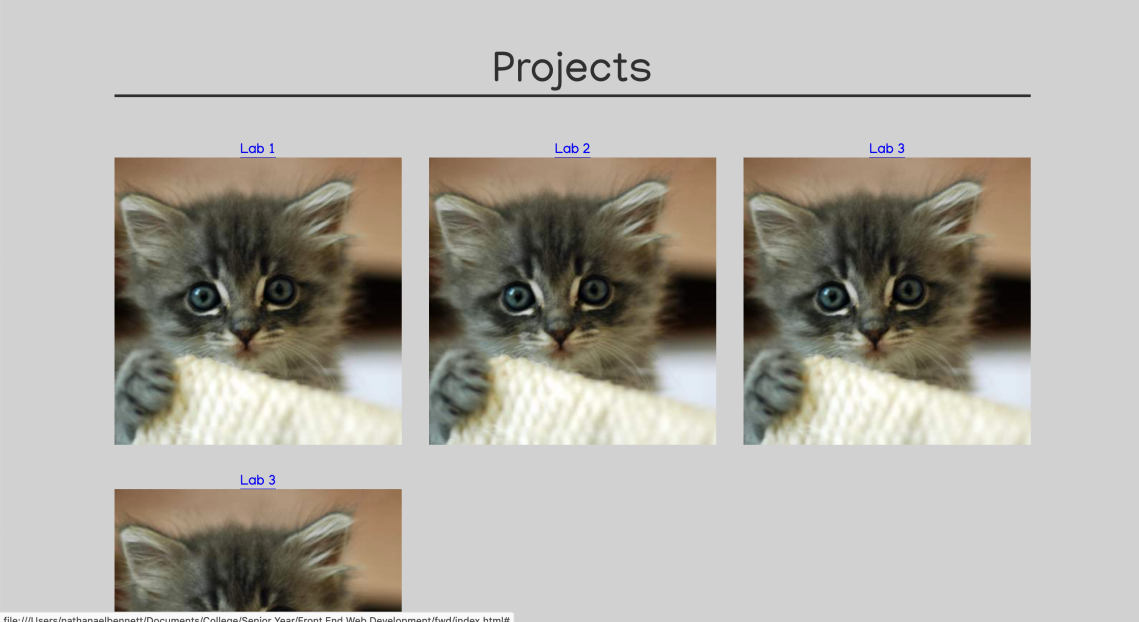
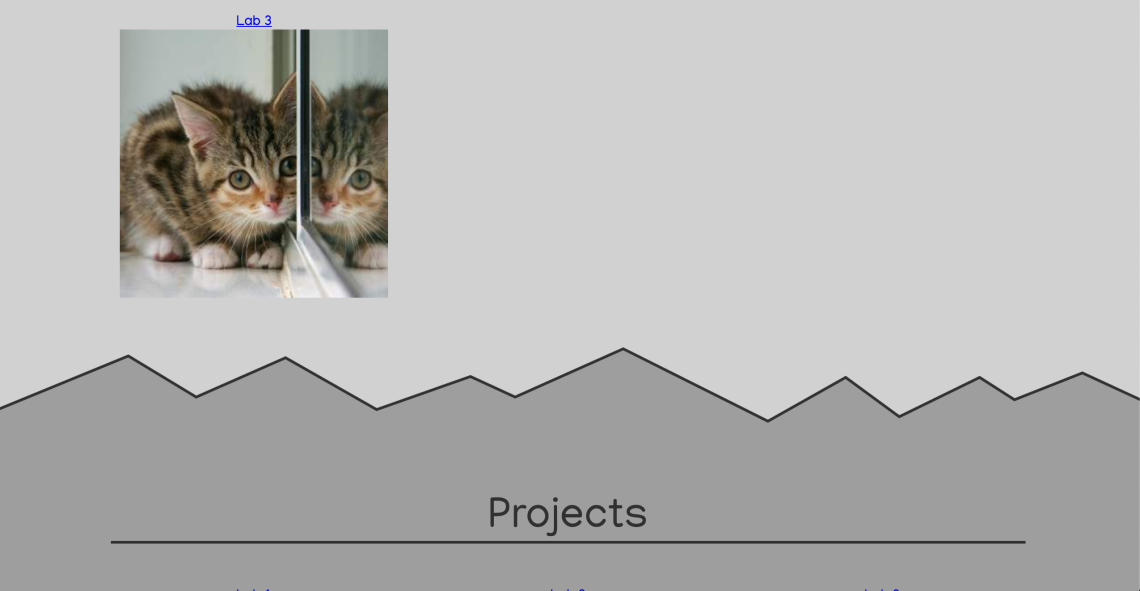
After that, I wanted to make some progress so I spent some time creating the basic HTML structure of the rest of the website. I used placeholder kitten photos to represent what would eventually become icons for my labs and projects, as can be seen in the photos below.


After using CSS grid to get the basics of my “Labs” and “Projects” sections working, I moved on to making more mountain graphics so that I could implement a layering effect as the user scrolls down the screen. This bit was a little frustrating; it’s been a while since I’ve used absolute positioning. I was trying to position each mountain graphic at the bottom of the section before it, and then I could make the background color of the next section match the graphic for a seamless transition. However, my first attempts weren’t very successful.


After doing a little bit of research on Mozilla’s excellent documentation site, I realized that an absolutely positioned object would only position itself to the closest ancestor that had “position: relative” declared in its CSS styles. None of my elements had this declaration, so my second mountain graphic was just using the viewport as its positioning context. Lesson learned!

After adjusting the spacing (margins) between each section and its corresponding mountain graphic, things were finally starting to take shape.

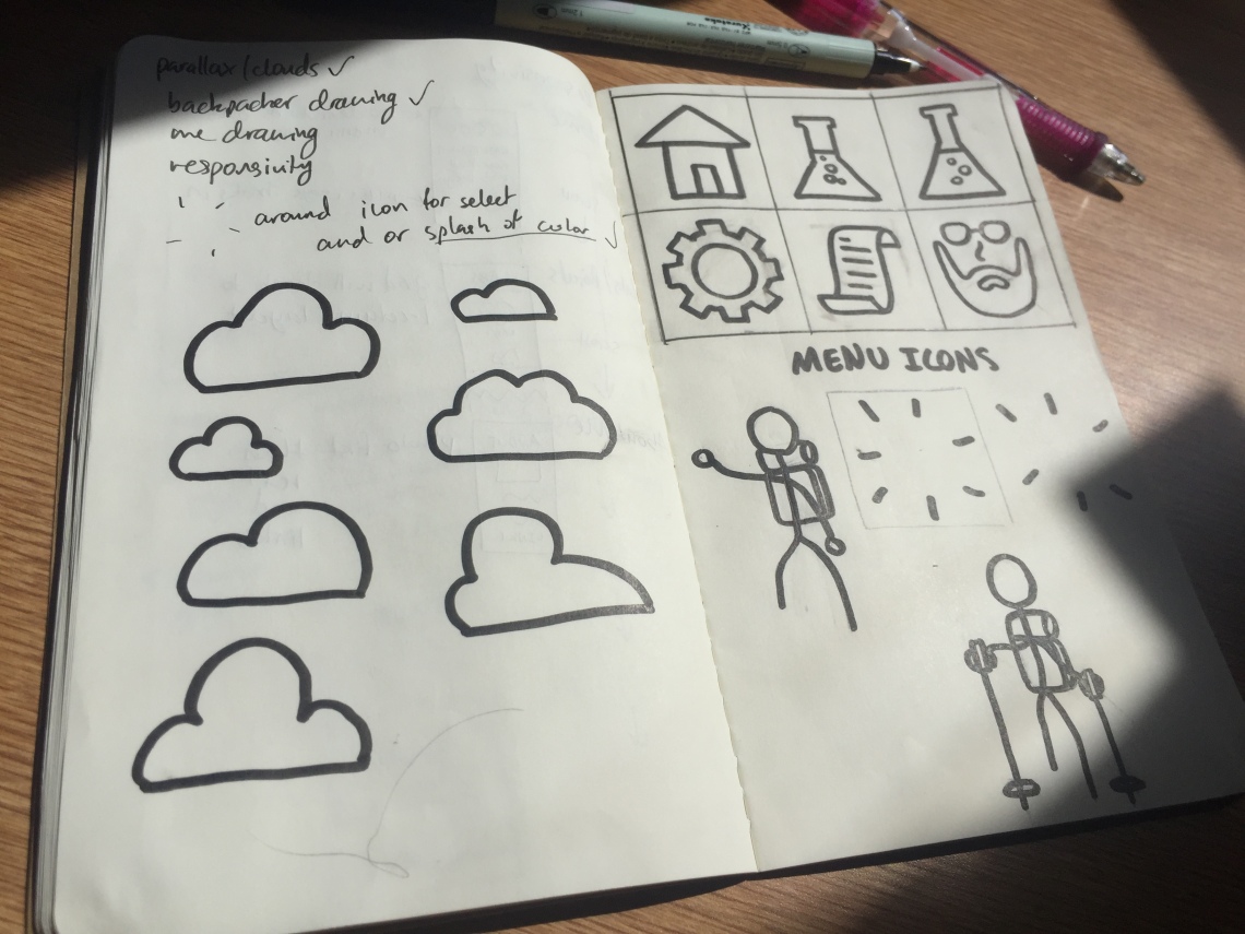
Now, it was time to take a break from staring at my computer and switch to my notebook to draw the icons for the menu. I want this site to feel organic and natural, and I’m hoping that hand-drawing my icons helps contribute to this effect.

Making the icons consistent sizes on paper made them much easier to size and manage in Illustrator too. I uploaded my photos to Illustrator, vectorized them, and exported them as .png files to use as my menu.


Now I had my menu ready to go, and I made it fixed so that the menu would stay with the user as they scrolled. However, this caused me another problem. When I put in my relative links to jump to different parts of the webpage, I realized that my menu was actually cutting off the top of my content for each hyperlinked section (see screenshot below).

This obviously was not ideal, so I had to figure out a way to adjust the scroll position of each hyperlink. I tried all kinds of solutions, including making empty divs with new hyperlinks in more convenient places on the page, and looking into alternative menu locations (like compressing it to the side of the page or shrinking it smaller as the page scrolled). However, I finally found a Stack Exhange discussion about this very issue, and tried implementing it for my needs. Through this process and some other resources, I also learned about the location.hash property and the hashchange event, which I had never heard about before. After some adjustments to the code suggested by the Stack Exhange post, I finally got my menu to jump to a better location for each section.


However, it turned out to all be for naught, because the next thing I wanted to do was implement smooth scrolling, so that when a user clicks on a link they are gently transitioned to that area about the webpage. I wanted this feature because I think it helps users be more oriented to where they are on a webpage, which is especially important for one long website like mine.
This feature was actually surprisingly easy to implement! All you have to do is add “scroll-behavior: smooth;” to your html CSS. For a few minutes it wasn’t working, but I realized I had forgotten to restart the sass watch command to recompile my CSS into the proper file after starting this coding session. Then, it worked great, except that my hyperlinks no longer worked properly. Instead of jumping to the right place on the page, my hyperlinks either did nothing or moved slightly up or down the page. I think the cause of this was that the smooth scrolling was interfering with the timing of JavaScript and jQuery code, and instead of actually jumping to the right part of the page, I was just being smooth-scrolled 170px up each time.
At this point, I decided that I would rather have smooth scrolling than a sticky menu, so I scrapped the fixed positioning of the menu. Now, it just stays at the top of the webpage, which I think is fine because my webpage isn’t actually very big and I don’t think it will be overwhelming or hard to navigate through it.
The next task was to implement some hover effects for my links. Since I only wanted the black parts of the .pngs to change color on hover (as opposed to the box of the link itself), I came up with a plan. I duplicated my icons, colored them a different color in Illustrator, and created some JavaScript to replace each regular icon image with a colored version on a mouseenter event (and then switching them back after a mouseleave event). This gives the impression to the user that they are simply highlighting each icon.


During this process, I didn’t write my JavaScript very efficiently, because I realized that I created a lot of different functions that do essentially the same thing. I ended up cleaning this up significantly later on by creating one function that I pass parameters to, which definitely made my JavaScript more concise. In the future, I’ll be on the lookout for functions that do similar things so that I can use one function for handling multiple cases.
Next, I spruced up the home page by sketching out and vectorizing a subtle background of clouds and a hiker figure, which I added to the first mountain layer (see picture below).


I also sketched out icons for the first two labs that I’ve already completed, so that I could go ahead and post them in my journal. The only problem I ran into here was that at first, my links weren’t responding to any clicks. I realized that one of my containers was actually on top of the links, so I wasn’t clicking on the links themselves. To fix this, I gave the links a z-index of 100 (just to be safe!), which got them working again. I added more JavaScript to give these lab links the same hover effect as my menu icons.

The only thing left to do now was to make one last sketch of myself for the About Me section. I considered doing a real picture, but decided that a sketch-style image would fit the aesthetic of my site better. After multiple tries (I’m trying to get better at sketching this year!) I came up with something that I was happy with, and vectorized it so I could add it to the site.

Finally, I had all of my site’s content, and most of its styling. I just had to make sure that everything was responsive. The biggest changes that I made here were to shrink down text and stroke sizes, and I shrunk the three-column grid (in my lab and project sections) down to two-columns on smaller screen sizes. On the About Me section, I put the image above the text on smaller screens, where on bigger screens the two elements are side-by-side. I was pleasantly surprised how most of my effects scaled down, like the mountain graphics and icons. Below you can see some screenshots of what the webpage looks like on smaller screen sizes.


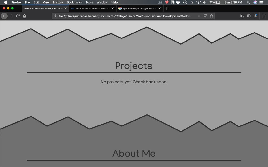
Once I had everything responding properly on every screen size I threw at it, I deleted the cat placeholder images in the Projects section and added a line of text explaining that I didn’t have any projects yet.

At last, I was done with my front-end development portal! I’m pretty happy with how everything came together, but the whole process took way longer than I expected to. I think part of the reason for that is how much time I spent on features that I ended up scrapping, like parallax and the sticky menu.
Lessons Learned:
What Worked:
- I think I did a good job of building out my website so that I can easily add more labs and projects in the future, so that it will look good no matter how much content is in there
- As I went through the process, I tried to remember what Aileen said in class about testing things as you go instead of writing a bunch of code and then finding out if it works! I definitely want to keep doing this in the future, I think it helped me catch bugs earlier on and saved me time in the long run
- I really enjoyed the process of sketching things on paper and then vectorizing them! I find it difficult to sketch with Illustrator, so it’s good to know that I can draw more efficiently on paper and then vectorize and adjust my images electronically
- Making my website responsive was actually one of the fastest parts of the process. I think planning ahead for responsivity was a big plus for this, and I learned a lot about absolute positioning and how to make it work regardless of screen size
What I Would Do Differently:
- Like I said above, I wasted a fair amount of time early on trying to get more advanced features to work, which caused the entire process of building this website to last way longer than it should have. Next time, I will build out the basic functionality first, and then experiment with advanced features like parallax if I still have time or think my website needs a little something extra
- When writing JavaScript, I can definitely do better at making functions that are reusable and versatile, instead of writing a separate function for each process. I think when we get into jQuery, that will help to make my code cleaner and simpler as well
- Even though I did a decent job of testing-as-you-go, there were still times when I realized I had done a fair amount of coding without testing anything. Then, when I ran into problems, it took longer to figure it out. I will keep this in mind for future projects!

 nate bennett